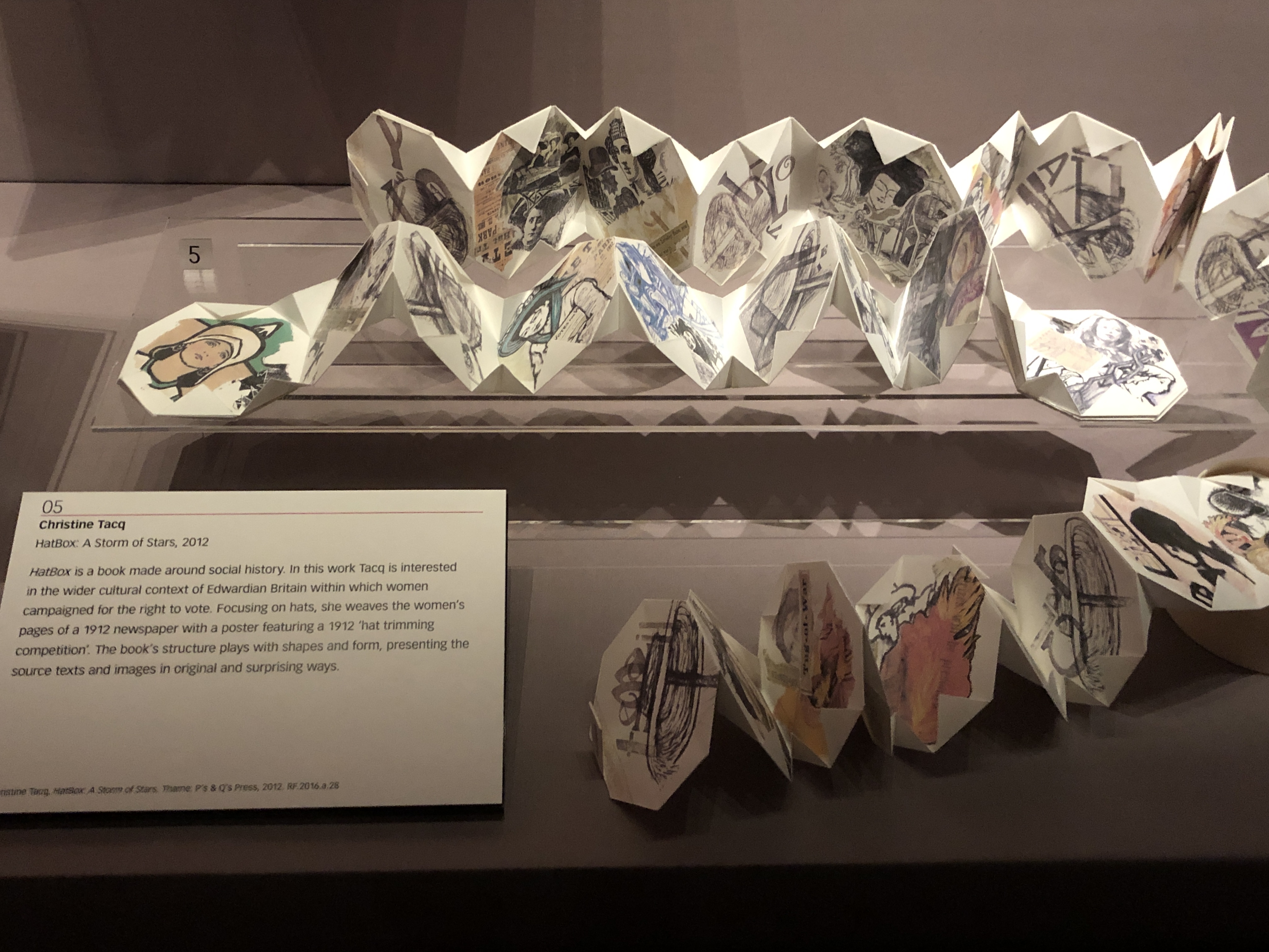
I decided to visit the British Library to look at a small exhibition of some of their artists books, I wasn't disappointed, it was a fascinating display!
I took photos of some of my favourites (the lighting was very dim so I apologise for the poor quality).
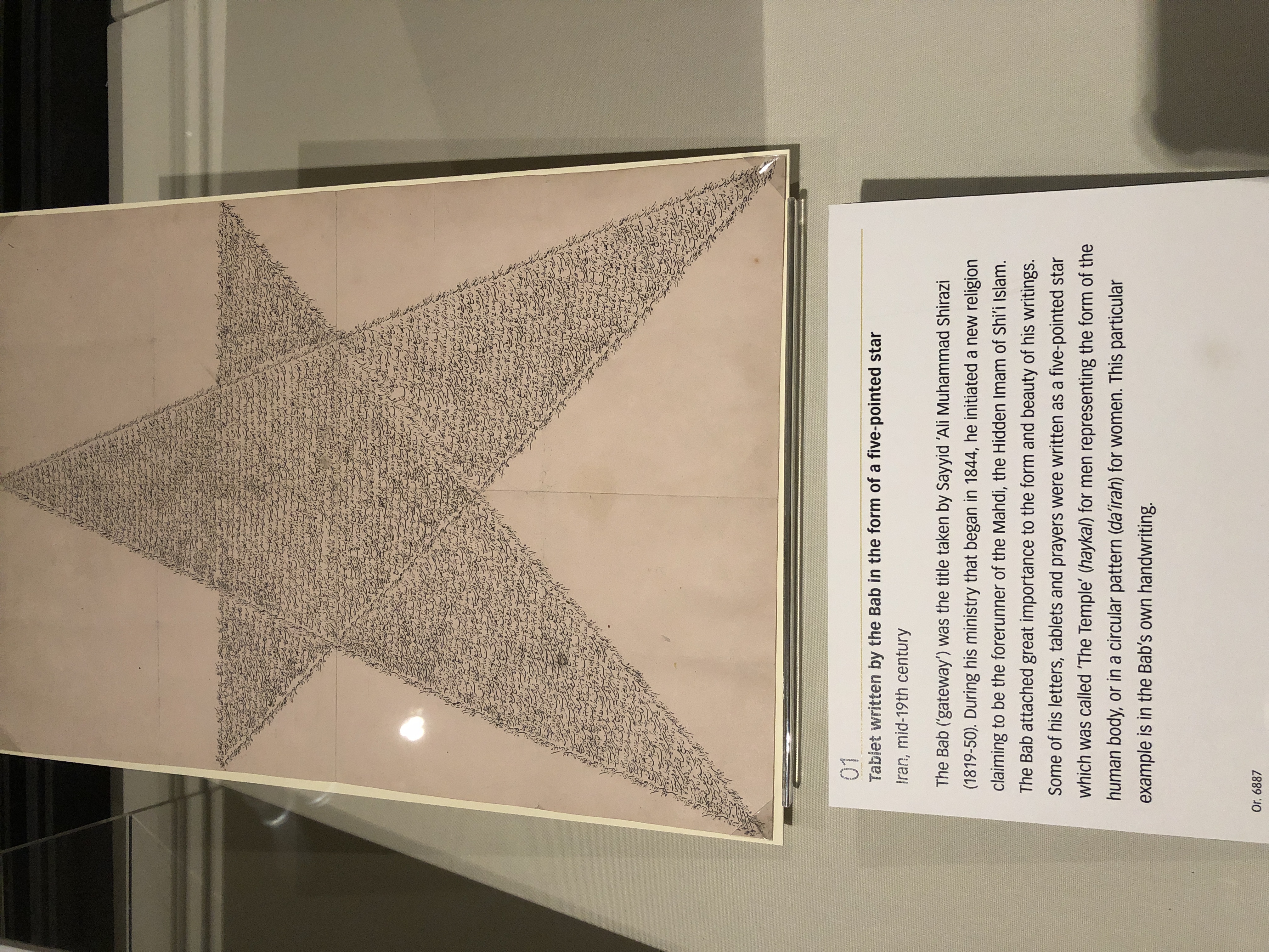
Not actually an artists book, but I loved the idea of the writing being in the shape of a star. It's a tablet from Iran written by the Bab (a title taken by Sayyid 'Ali Muhammad Shirazi 1819-1850) and the shape represents the male human body.
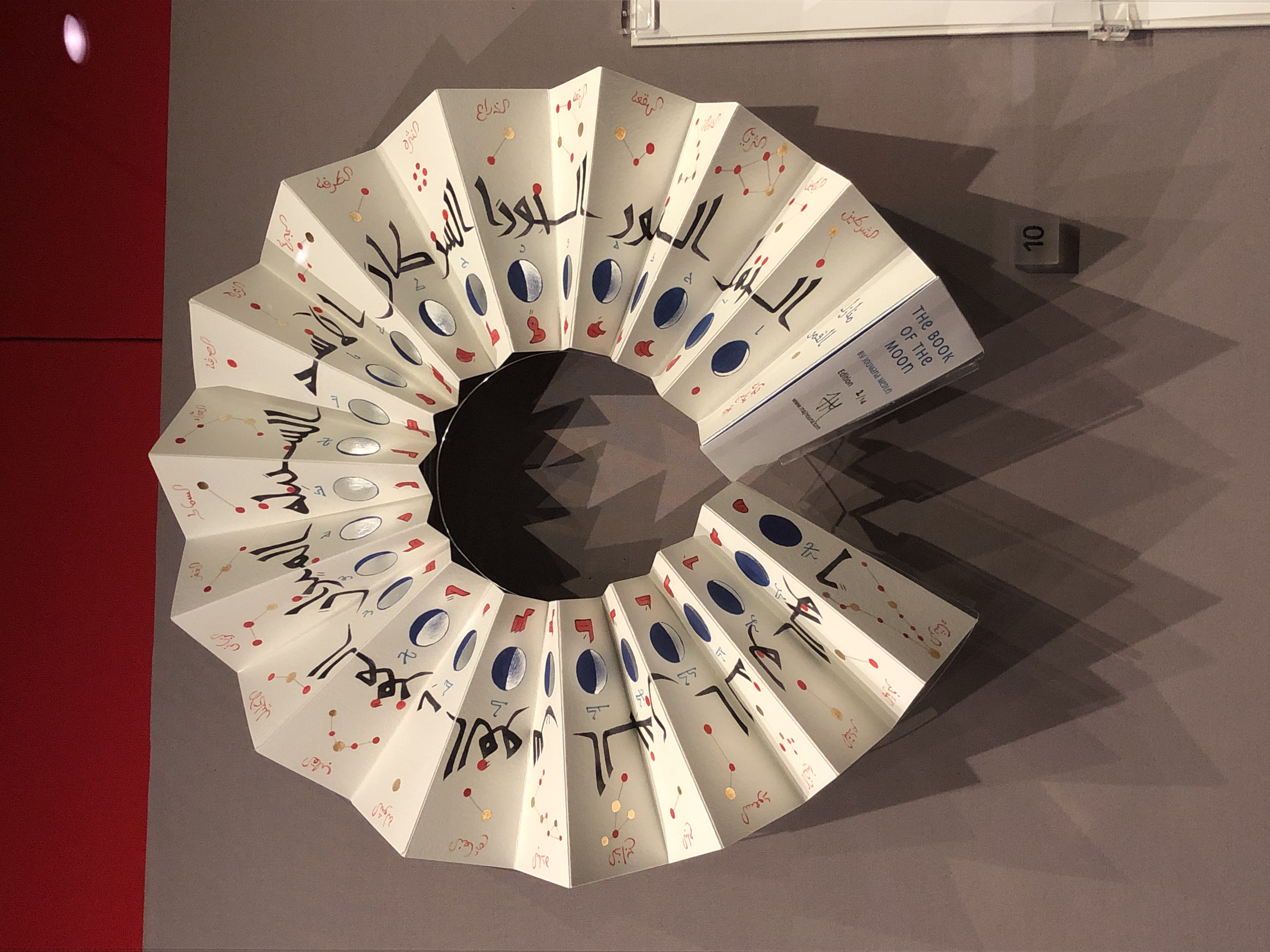
On the right is The Book of the Moon by Joumana Medlej, created in 2018
The information about this reads "The Book of the Moon is designed to be worn around the neck in a case like an ancient magical talisman. It unfolds into a circle revealing the 28 phases of the moon. Each phase is accompanied with groups of stars and the zodiacal signs that it travels through. Accompanying the phase is a letter from the 28-letter Arabic alphabet most closely associated with this cycle. In an edition of 14, also a moon-related number, this book takes inspiration from the visual language of medieval Islamic astronomical charts. The diagrams of the constellations are accurate, but simplified in the style of period texts. Four different early scripts are used to depict the different layers of information and evoke a sense of wonder." (British Library)

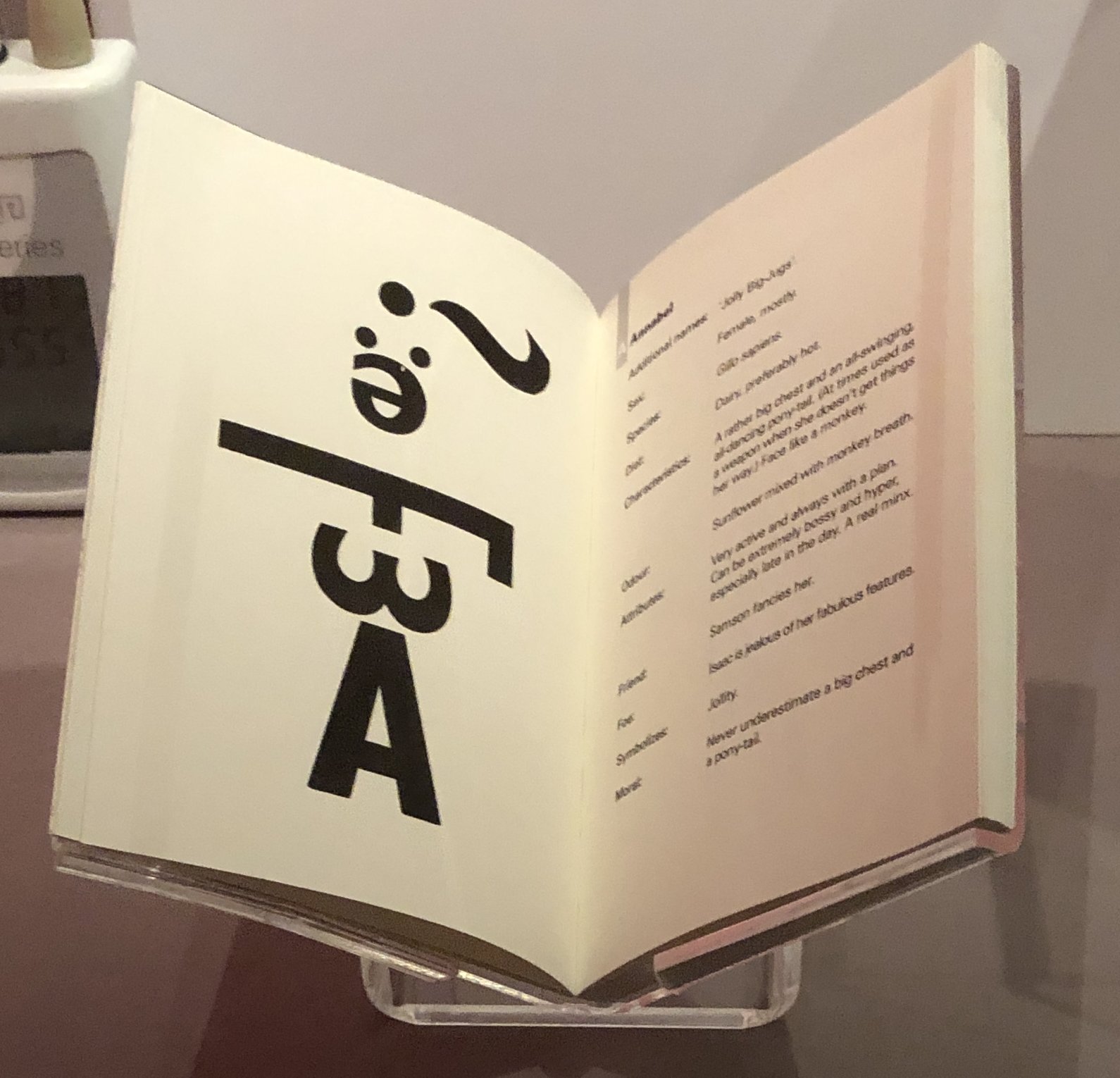
On the right is a book by Sofie-Mette D Ambeck, the title of it is "Ambeck's typographic Bestiary A-Z, 2006." and the information about it reads "While studying at Central St Martins, London in 1998-99, Ambeck witnessed a collection of strange typographical creatures residing in the basement there. They leapt off the proofing press and into the street around Southampton Row, never to be seen again. This work captures some of them." (British Library)
I think the idea of typographic beasts is very inventive, something I could think about for my own 'creatures'.

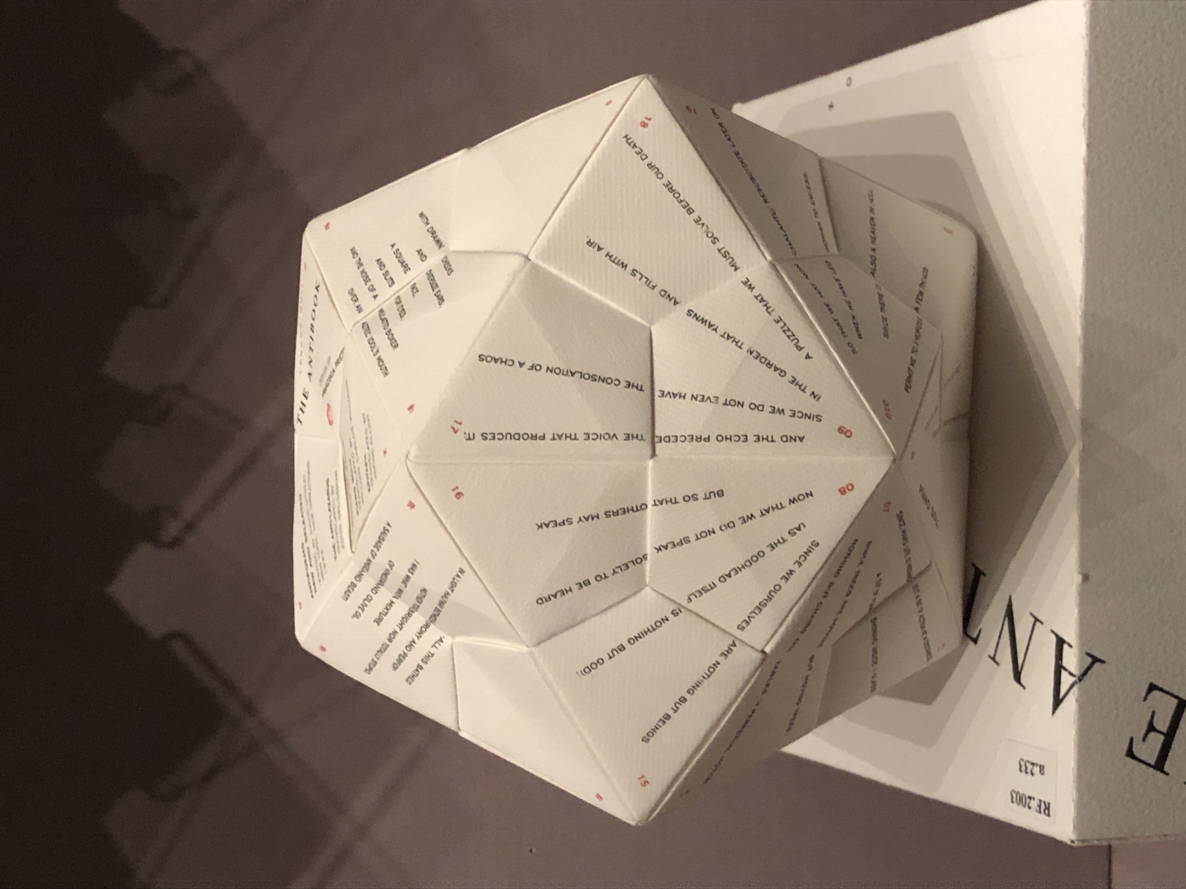
On the left is The Antibook by Francisca Prieto, created in 2002.
The information about this book says "The Antibook uses Nicanor Parra's work AntiPoens to challenge what a book should be. Presented in traditional bookform the work makes no sense. It needs to be assembled as a three-dimensional Icosahedron for the text to be readable. Prieto creates a work that reacts both with and against the original poems" (British Library)
I think this is an intriguing idea and I may try a simple shape out myself!

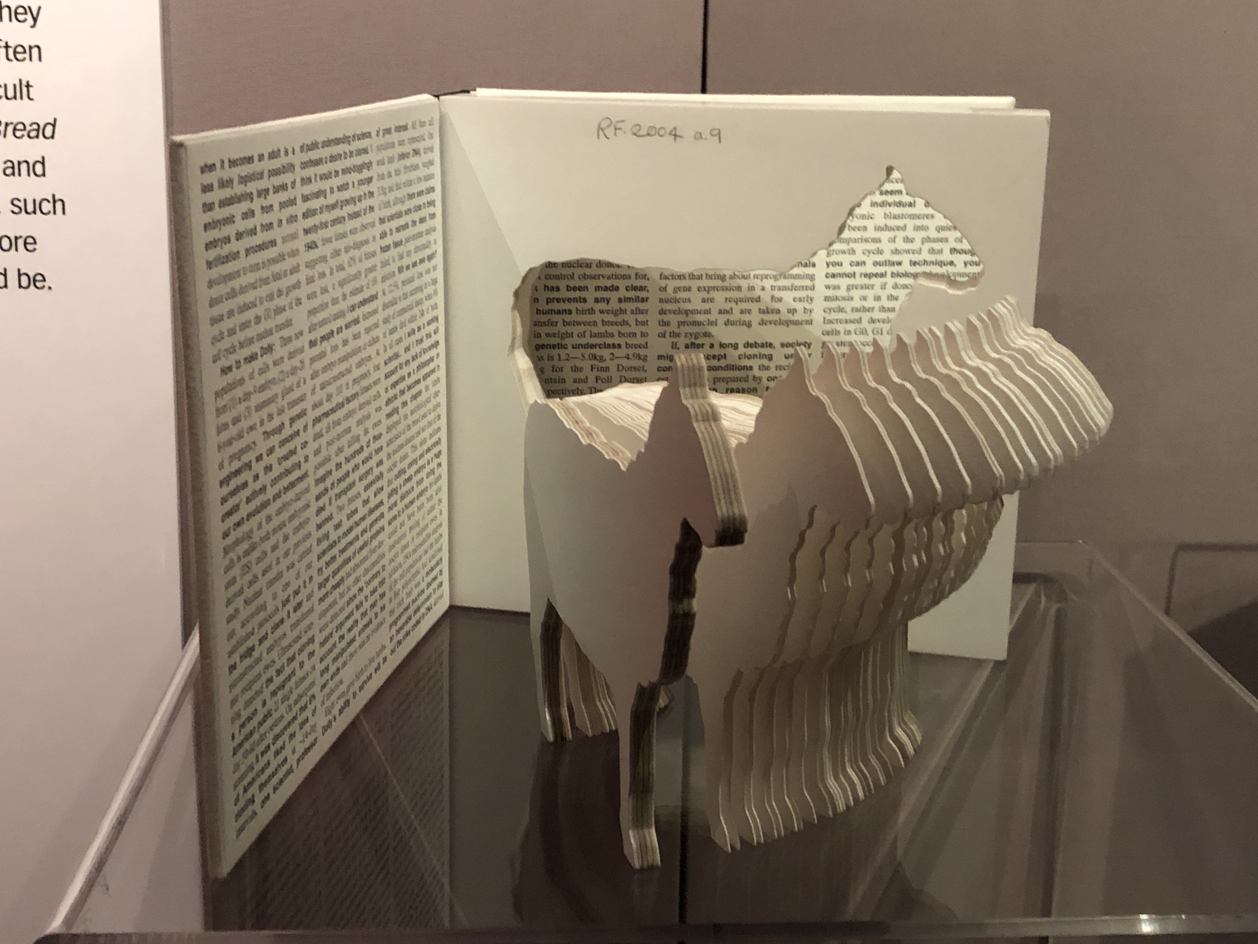
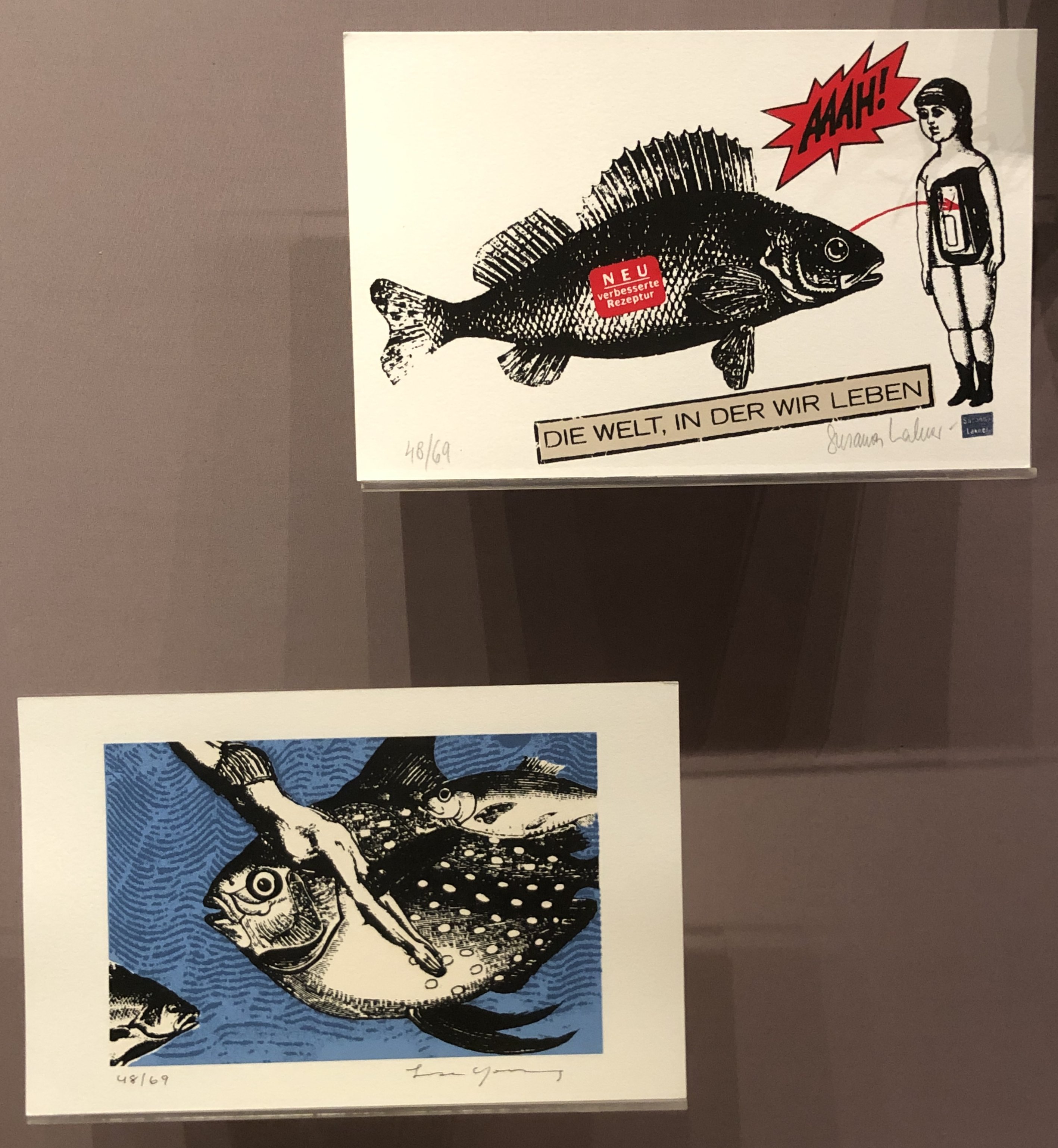
Lastly we have Fish-box created in 2008
This is the information about this exhibit "Fish-Box brings together a range of artists from 11 countries to create 26 silk screen prints around themes related to fish. All the prints are presented in a replica fish-and-chip shop box, complete with its own replica fish. The work includes contributions from Lisa Young, Susanna Lakner and Ros Blackmore, and is assembled by Frantic Ham a partnership between South Korean artist Antic-Ham (Hyemee Kim) and Francis van Maele of RedFox Press." (British Library)
This is one of my favourites, I think the presentation (in a box) is very original and I very much like the idea of collaboration, producing varied work, but all held together by a single theme.